A new university campus in Ankara. Student dormitories, classrooms, cafeterias, libraries and administrative units are positioned to easily reach each other. A lot of effort has been made to ensure that students spend their time in a well-designed modern and spacious environment while continuing their education. Even sitting around and watching the big hedge in the middle of the buildings can make people happy.
Almost all the outer foreheads of the buildings in the project, built in neoclassical style, are bricked. Due to the different but selected colors in harmony, the monotony is blocked and the building belonging to each one is separated from the others. On the walls of the interior, bricks were also used in different textures and colors. As you walk around the floors, you can see the classrooms and the rooms in different floors from the galleries. With specially designed glass, classroom interiors can be seen from corridors and gallery openings, emphasizing spatial transitions while corridors are invisible through the classroom. The main element of design; The spatial articulations are highlighted both vertically and vertically within the building. In the areas where classes are concentrated, the main gallery opened classrooms and the specially used double-hulled glass system class carries the circulation areas of the building and the design is improved through the diversity concepts given by the different apartment facades in a street. Asymmetric gallery spaces and a classical pavilion create a dynamic structure within the building.
In the majority of the buildings, the walls of the entrance hall are covered with brick in a modern smoky color. Thus, while creating a contrast with the white doors and ceiling, the floor covered with the black and white marbles on the floor was an extraordinary fit. The solid wood units used in the environment are black and white. By means of intense and strong light, it is perceived as if the place is illuminated with daylight.
The male hall has similar features. However, pastel white brick was used in these walls.
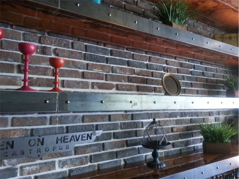
On the right side there is a cafe. When you enter the cafeteria you feel like you are entering a well-lit, well-planned and expensive restaurant. This time the lights give a warmer light. Traditional Flander style brick-lined walls, wooden tables and chairs provide a warm ambiance with the contribution of wooden flooring.
The campus has an area of approximately 160.000 m2 built by Craft312 Studio. The campus has a design language that is human oriented, comfortable and comfortable on the front panel, away from typology, which is known as architectural design. Craft312 Studio received the A'Design Award 2015 award, which is the most important prize awarded to Italy by international projects, every year with the University's Preparatory Building in the category of Interior Design.
Architecture: GT Design
Interior Architecture Projects: Craft312 Studio Architecture - Onur Karl?da? & Deniz Karl?da?
Production Year: 2012


